


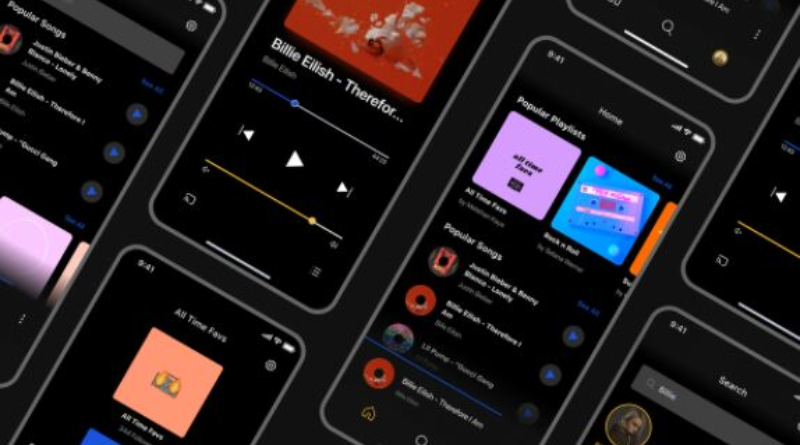
In the ever-evolving landscape of mobile app design, certain user interface (UI) elements have stood the test of time. Among these, radio buttons continue to play a pivotal role in enhancing the user experience (UX) by facilitating clear, efficient decision-making. For designers looking to refine their skills, studying current radio button design trends provides valuable insights into what works in popular mobile apps today.
As mobile users demand ever-faster, more intuitive digital experiences, the interface elements that power crucial moments of choice must be both familiar and efficient. Radio buttons fill this need by offering users a reliable way to make single, mutually exclusive selections, making apps easier and faster to use.
Understanding Radio Buttons in Mobile UI Design
Radio buttons are interactive UI elements that allow users to select one option from a predefined set. Their design is typically circular, with a filled center indicating the selected choice. This familiar design has become a staple in user interfaces, serving as a visual cue that users instinctively understand. It creates a consistent and intuitive way for people to make choices, especially on mobile devices where space is at a premium.
Radio buttons are commonly used in mobile forms, preference selections, and settings menus. Their primary function is to prompt the user to select a single option from a set of possibilities. Leveraging this form of input reduces users’ cognitive load, streamlines processes such as onboarding and checkout, and helps prevent data-entry errors.
The Importance of Radio Buttons in Mobile Applications
Screen size constraints on mobile devices challenge designers to create interfaces that maximize efficiency without sacrificing usability. Radio buttons are particularly effective because they display up to 5 or 6 options in a single view, eliminating the need for dropdown menus or extra screens. This is essential when users are completing tasks that require a clear, singular decision, such as setting notifications, selecting a delivery option, or answering survey questions.
Beyond their space-saving advantage, radio buttons help prevent ambiguity. Their design enforces a single selection, reducing the likelihood of accidental multiple choices and supporting error-free user interactions. This makes them ideal for scenarios where clarity and speed are paramount.
Best Practices for Implementing Radio Buttons
- Ensure Adequate Size and Spacing:Radio buttons should be sufficiently large for finger taps and spaced far enough apart to avoid accidental selection, especially on smaller screens.
- Use Clear Labels:Each radio button must be paired with a concise, descriptive label to clarify the selection and limit confusion.
- Maintain Consistency:Utilize recognizable shapes, such as the standard circle, and keep the visual styling consistent across your application to meet user expectations.
- Group Related Options:Display related choices together, either vertically or horizontally, so users can quickly scan and compare their options.
Enhancing Accessibility with Radio Buttons
Accessibility should be a core component of every design decision. Radio buttons support accessibility by offering distinct visual states (selected and unselected), supporting screen readers, and being navigable via keyboard and touch. Mobile operating systems, such as iOS, provide built-in support for standard UI elements, ensuring that users with visual or motor impairments can interact with apps seamlessly. This underscores why using conventional UI components is so important for developers aiming to reach the widest possible audience.
Comparing Radio Buttons and Checkboxes
Understanding the distinction between radio buttons and checkboxes is vital for effective UI design. Radio buttons are designed for situations where only one option can be selected at a time, enforcing mutual exclusivity. Checkboxes, in contrast, allow users to select multiple items from a list, supporting tasks like choosing filters or selecting interests.
- Radio Buttons:Allow users to select one option from a set of mutually exclusive choices.
- Checkboxes:Enable users to select multiple options from a list.
Using these elements interchangeably or incorrectly can confuse users, disrupt workflows, and lead to errors in submitted information, ultimately affecting satisfaction and trust in the app.
Real-World Applications of Radio Buttons
Radio buttons are frequently found in mobile surveys, polls, and signup forms. For example, a health and wellness app might prompt users to select their activity level with a set of radio buttons labeled “Low,” “Moderate,” and “High.” This setup lets users make their selection quickly and helps the app provide more tailored recommendations. Another instance can be seen in food delivery apps, where users select just one address for order drop-off or pick one payment method during checkout.
These scenarios underscore the versatility and effectiveness of radio buttons for streamlining user journeys and improving completion rates in a wide range of app experiences.
Conclusion
Despite rapid advancements in mobile app design, radio buttons remain indispensable for their simplicity, clarity, and effectiveness in facilitating user choice. By adhering to current best practices and prioritizing accessibility, designers and developers can ensure that this timeless UI element continues to enhance usability and satisfaction for a diverse, ever-growing user base. Thoughtfully designed radio buttons will remain a cornerstone of intuitive, accessible, and delightful mobile interfaces for years to come.